Introduction: Why Stock Charts Matter
How to read stock charts is a fundamental skill every investor must develop to navigate the stock market confidently. Stock charts provide visual representations of price movements, allowing investors to analyze trends and make informed decisions. Without understanding how to read stock charts, traders might struggle to identify potential investment opportunities or risk falling for market fluctuations.
In this guide, we’ll explore how to read stock charts effectively, discuss different chart types, explain key indicators, and help beginners interpret trends with ease.
Types of Stock Charts
1. Line Chart
- The simplest type of chart, representing a stock’s closing prices over a specific period, plotted as a continuous line.
- Helps visualize overall market trends without noise from daily price fluctuations.

- Commonly used by long-term investors and analysts to observe historical performance and trend direction.
- Available on financial platforms like TradingView, NSE India, and Moneycontrol, where users can select a stock and adjust the timeframe to analyze past price movements.
2. Bar Chart
- A bar chart provides a more detailed view of price movements by displaying the opening, closing, high, and low prices for a given time frame.
- Each bar represents a single time period (e.g., one day, one hour) with a vertical line showing the price range and small horizontal ticks indicating the opening (left tick) and closing (right tick) prices.

- Useful for understanding price volatility and trends, making it a preferred choice for traders analyzing short-term price movements.
- Available on platforms like TradingView, NSE India, and Moneycontrol, where users can adjust timeframes and analyze historical price fluctuations.
3. Candlestick Chart
- The most widely used chart type, offering detailed insights into price movements.
- Each candlestick represents a specific time period (e.g., one day, one hour) and consists of four key components: open price, close price, high, and low.
- A green candle (or white in some charts) forms when the closing price is higher than the opening price, indicating upward movement.
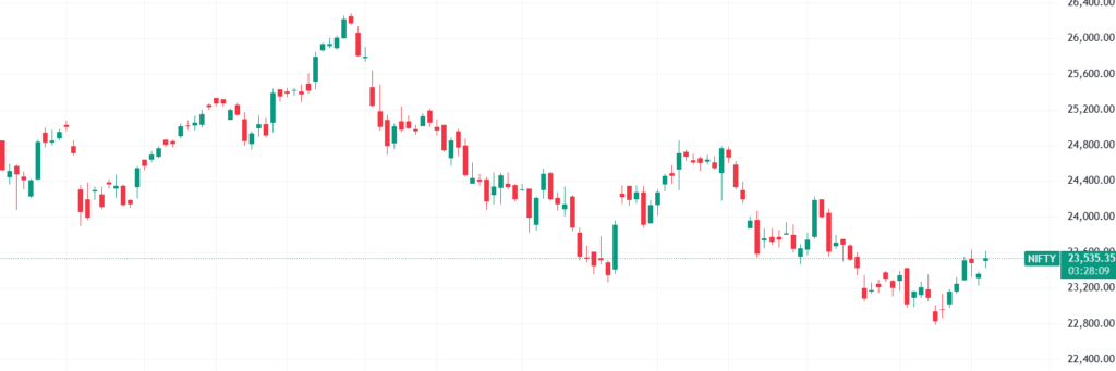
- A red candle (or black in some charts) forms when the closing price is lower than the opening price, indicating downward movement.
- The body of the candle represents the price range between opening and closing, while the wicks (shadows) indicate the highest and lowest prices during the time frame.
- Candlestick charts help traders identify trends, reversals, and patterns like Doji, Hammer, and Engulfing patterns, which provide insights into future price movements.
Key Stock Chart Indicators
1. Moving Averages (MA)
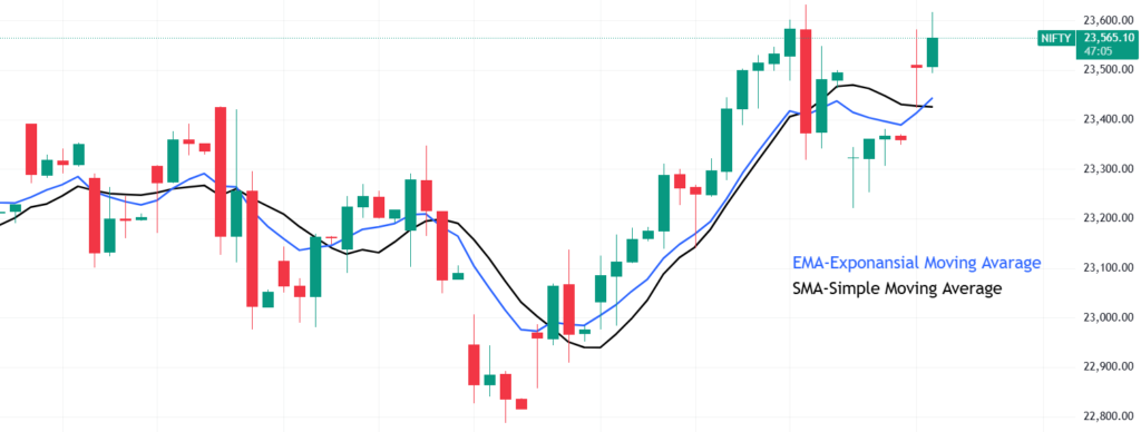
- Simple Moving Average (SMA): Average price over a specific period.
- Exponential Moving Average (EMA): Puts more weight on recent prices.
2. Relative Strength Index (RSI)
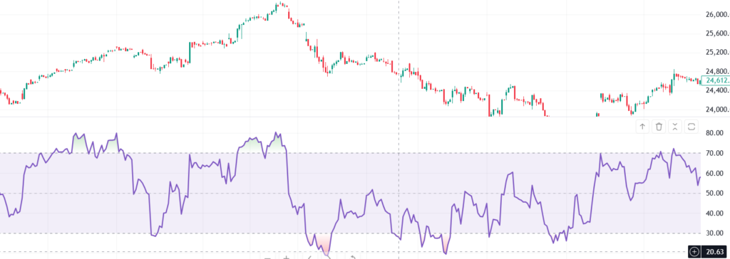
- Measures momentum; RSI above 70 indicates overbought conditions, below 30 indicates oversold conditions.
3. Bollinger Bands

- Consist of a middle moving average and two outer bands.
- Helps identify overbought or oversold conditions.
How to Analyze Stock Chart Patterns
1. Support and Resistance Levels
- Support: Price level where a stock tends to stop falling and may bounce back.
- Resistance: Price level where a stock tends to stop rising and may pull back.

2. Trendlines
- Trendlines help traders identify the general direction of a stock’s price movement over time. By connecting a series of highs (peaks) or lows (troughs), investors can visualize whether a stock is in an uptrend (rising prices), downtrend (falling prices), or sideways trend (stable prices).
- For example, if a stock makes consecutive higher lows, drawing a trendline beneath these points reveals an upward trajectory, signaling a potential bullish trend. Conversely, a series of lower highs forming a descending trendline suggests a bearish trend.

3. Common Chart Patterns
- Head and Shoulders: Signals a potential reversal.
- Double Top and Double Bottom: Indicates trend exhaustion.
- Triangles (Ascending, Descending, Symmetrical): Show continuation patterns.
How to Read Any Type of Chart Easily
Understanding stock charts becomes easier when you break them down into a few simple steps:
- Identify the Timeframe:
- Short-term traders use 5-minute, 15-minute, or hourly charts.
- Long-term investors focus on daily, weekly, or monthly charts.
- Observe the Price Movement:
- Look at the general trend—Is the stock moving upward (bullish), downward (bearish), or sideways (neutral)?
- Use Moving Averages for Clarity:
- Moving averages help smooth out price fluctuations.
- Example: If a stock’s price is consistently above the 50-day moving average, it suggests an upward trend.
- Look for Support and Resistance Levels:
- Support is where the stock has historically stopped falling and bounced back.
- Resistance is where the stock struggles to rise above.
- Example: If Reliance Industries keeps bouncing off ₹2,200, that’s a strong support level.
- Analyze Chart Patterns:
- Head and Shoulders: Predicts reversals.
- Triangles (Ascending, Descending, Symmetrical): Indicate continuation.
- Example: If Infosys forms a Double Bottom pattern, it may indicate a price rebound.
- Check Indicators for Confirmation:
- RSI above 70: Overbought (price might drop).
- RSI below 30: Oversold (price might rise).
- Bollinger Bands expanding: Increased volatility expected.
Conclusion: Mastering Stock Charts for Better Investing
Reading stock charts can enhance your ability to make smart trading decisions. By understanding different chart types, indicators, and patterns, you can develop a solid foundation in technical analysis.
Practice analyzing charts using free platforms like TradingView to improve your skills.
FAQs
1. What is the best stock chart type for beginners?
A line chart is simplest, but candlestick charts provide deeper insights into price action.
2. How do I know if a stock is overbought or oversold?
Use RSI; above 70 is overbought, below 30 is oversold.
3. Can stock charts predict future prices?
They help identify trends, but no chart guarantees future movements.
4. Where can I practice reading stock charts?
Websites like TradingView, NSE India, and Moneycontrol offer free charting tools.
5. Do I need technical indicators to trade stocks?
Not necessarily, but indicators can help make informed decisions.